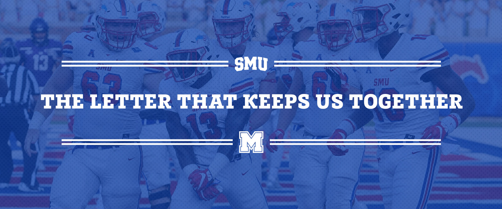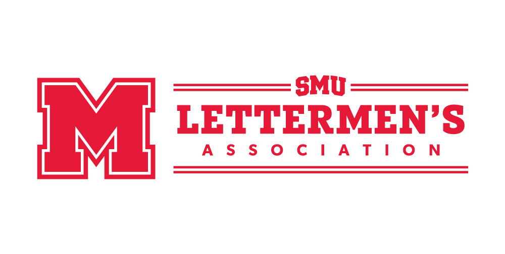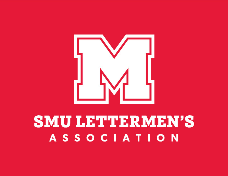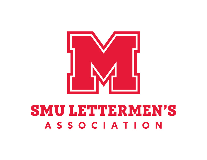
logo REbrand, art direction, brand guide, merchandise, collateral, Social Media
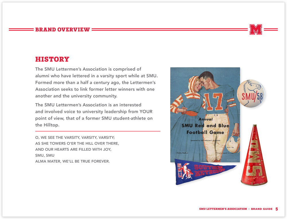
The SMU Lettermen’s Association is comprised of alumni who have lettered in a varsity sport while at SMU. Formed more than a half a century ago, the Lettermen’s Association seeks to link former letter winners with one another and the university community. I was asked to rebrand the Block M formal logo. The goal was to preserve the tradition of the actual letter M given to student-athletes, but also create a clean & contemporary collegiate look, that will appeal to new graduates for years to come.
photos © smu